The Best Colors to Wear for Photos
But what will I wear? This is always one of the top questions when it comes to photo time. When choosing what to wear, a good place to start is making a color palette. Choosing colors that compliment your location, are flattering to your skin tones, and look good on camera should be the foundation of building your color palette. The following color breakdown is here to help you figure out the best colors for photo sessions.
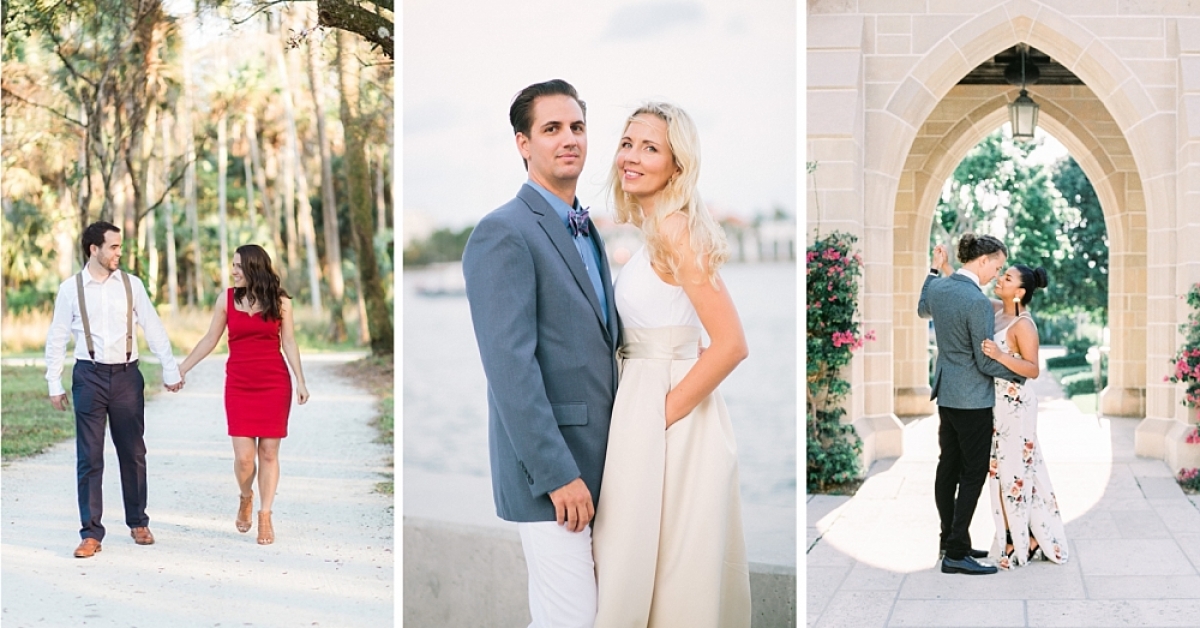
Neutrals

Neutrals are the safest options when it comes to photos. You can’t go wrong with a palette of whites, creams, beiges, and tans. This color palette allows the wearer to be the focal point of the photo. It also makes outfit coordination fairly easy because it nearly eliminates the dilemma of matching different colors together. Usually, everything in the neutral color family tends to work well together. This color scheme also works well in most locations so it’s a safe bet no matter what setting you choose for your photo session.
Pastels

Pastels are a degree away from neutrals. Soft blues, pink, sage green, lavender, peach, or even a pale yellow all fall under the pastel umbrella. They’re also a safe option for a photo shoot and a great way to incorporate color if you’re hesitant to use it. They pair well mixed together or with neutrals. Pastels are also versatile in that you can easily dress them up with a pair of heels and a suit jacket or dress them down by pairing them with jeans.
Brights

Bright colors are probably the trickiest thing to pull off for a photoshoot. They work well if you’re used to wearing bright colors and mixing them and matching them with your wardrobe. They’re a great option for standing out against your location. Brights can also be a great way to compliment your features. If, for instance, green makes your eyes pop or your skin tone look amazing, then finding an amazing green top or dress may be the way to go for photos. Colorful clothing items should be balanced with neutrals and/or complementary pastels. The biggest caution for wearing bright colors is that it can cause color casts onto the skin depending on the lighting. If you wear a red dress, for instance, the color could end up reflecting back onto your skin making you appear overly flushed or lobster-like.
Darks

Dark colors are often the most flattering colors. Depending on the fabric, they can hide wrinkles and lumps, and bumps in the fabric a little more efficiently than lighter colors. Dark colors can also help place the focus back on the subject’s faces and features rather than the clothing itself. You can easily pair dark colors with lighter neutrals, pastels, or even with a pop of a bright color (think a black dress with red lipstick, earrings, or shoes). I would recommend using dark colors when your setting is going to be in a lighter area like downtown, at the beach, or in a field of wheat-colored grasses. Dark colors in a dark location can look underwhelming in a photo.
I hope these tips help you rock your wardrobe for your next photo session, but if you’re still feeling indecisive about your clothing choices, definitely consult your photographer. They’ll be able to offer insight on which of your options will look best on camera and be the most flattering.
Comments
Related Posts

3 Important Questions to Ask Your Wedding Photographer
Hiring a professional wedding photographer will be one of the best and most important decisions…
Leave A Comment